Finish palette
Quartz, quartzite, porcelain, marble-look surfaces, pale natural stone, light wood, handmade tile, glass, and soft woven textures are common fits.
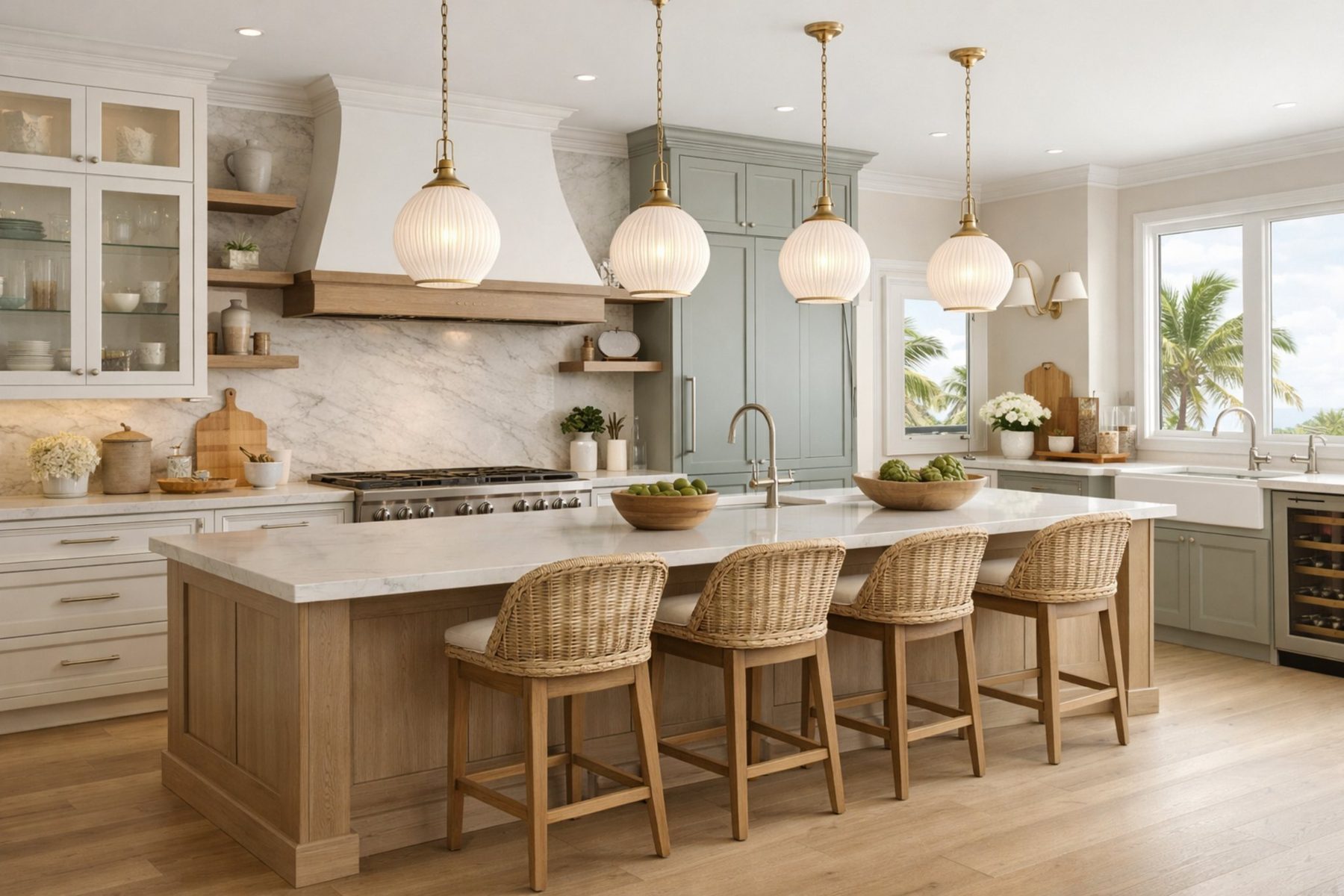
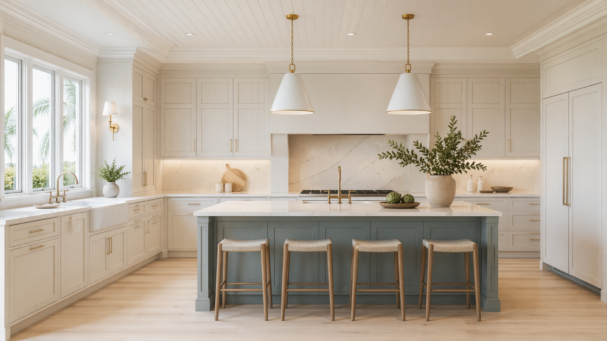
Coastal cabinetry works best when it feels airy, fresh, and regionally aware while still staying polished. The goal is not seashell décor or nautical shorthand; it is light control, natural texture, practical storage, and a softer material palette that still feels premium.
Coastal design is a balance between openness and discipline. It usually leans lighter in color, more relaxed in texture, and more generous with natural light. The strongest coastal rooms still have structure: clear cabinet proportions, durable finishes, controlled hardware, well-planned storage, and surfaces that support daily life in a bright, often sun-heavy environment.
Clients who want a bright, breathable room with easy elegance, lighter finishes, and a Florida-aware posture that feels relaxed without feeling casual or themed.
The value is emotional lift. Coastal rooms can make kitchens, laundry rooms, bathrooms, and bars feel larger, fresher, calmer, and more connected to natural light.
Cost usually moves with the quality of painted finishes, stain-grade light woods, panel-ready appliance integration, custom hoods, workstation sinks, open shelving, natural stone or porcelain surfaces, and lighting that keeps pale palettes from feeling flat.
Coastal fails when every choice tries to say beach. The room needs restraint, depth, and practical finishes so it feels architectural rather than decorative.
A style becomes real through the cabinetry elevation. Door shape, construction type, reveal spacing, drawer rhythm, hood treatment, appliance integration, and open-versus-closed storage determine whether the room feels authentic or simply decorated.
The cabinetry does not have to announce the style loudly. It needs to support the room consistently, from the most visible wall to the storage zones that clients use every day.
Paint, stain, countertop, backsplash, hardware, lighting, and texture need to work as a system. A beautiful inspiration image is only useful when the materials can be specified, maintained, and lived with honestly.
Quartz, quartzite, porcelain, marble-look surfaces, pale natural stone, light wood, handmade tile, glass, and soft woven textures are common fits.
Countertop movement should feel breezy and natural, not overly dramatic or cold. Warm veining usually works better than high-contrast graphic movement.
Backsplashes can be slab, soft tile, zellige-style texture, quiet stone, or a simple full-height surface when the room needs less visual interruption.
Use blue, green, rattan, brass, nickel, or black accents as supporting notes, not as the entire identity of the room.
Brushed brass, polished nickel, satin nickel, soft bronze, black accents, small knobs, cup pulls, and slim pulls can all work. Hardware should feel refined and functional rather than nautical.
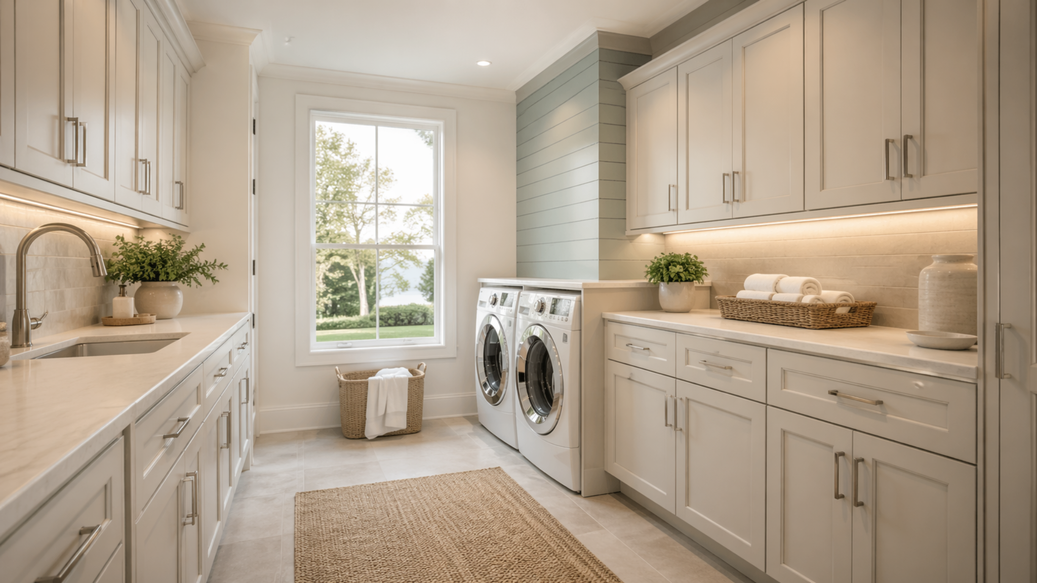
Coastal is especially strong for kitchens, laundry rooms, bathrooms, bars, pantries, and mudroom-style storage where brightness, daily ease, and light material palettes create value.
Coastal spaces should feel fresh, calm, and practical. Study how light finishes, natural texture, storage, and surfaces create ease without relying on beach décor.
Evaluate cabinet rhythm, finish balance, storage visibility, hardware scale, and how the room supports everyday use without drifting from the style direction.
Use this view to confirm that the same design language can carry into another room, built-in, or cabinetry moment while still feeling natural to the home.
Client-facing style education should be honest about maintenance, specification risk, and the places where the look can stop adding value.
Light painted cabinets show scuffs, dark rub marks, and food stains faster than deeper finishes. Open shelves collect dust. Natural woods need protection from standing water, sun exposure, and harsh cleaners. Pale grout and textured tile require realistic cleaning expectations.
A coastal room can feel washed out if every surface is white or pale. It also becomes dated quickly if it depends on obvious motifs instead of proportion, texture, and material quality.
The stronger the style direction, the more important storage planning becomes. Visible clutter, weak appliance planning, and underbuilt drawer organization can damage the final look quickly.
Lighting temperature and placement change the style dramatically. Warmth, shadow, and undercabinet lighting often determine whether the room feels finished at night.
Door samples, finish samples, stone slabs, hardware finish chips, tile, and lighting temperature should be reviewed together whenever possible. One sample alone rarely tells the full truth.
The right style should still make sense after the novelty wears off. A premium room needs identity, but it also needs durability, function, and restraint.
Coastal blends well with transitional, contemporary, Scandinavian, tropical, and French Country influences. It should lead through lightness and texture, while the supporting style controls how formal, casual, or modern the final room feels.
Before approving the direction, confirm whether the room has the right architecture, light level, maintenance tolerance, storage plan, and budget posture to support the look. That is what keeps the finished space from feeling forced.
Black Label turns style preference into cabinetry planning, material hierarchy, storage decisions, and a finished result that feels intentional under real use.