Finish palette
Quarter-sawn white oak, oak, maple, walnut tones, warm painted finishes, honed stone, soapstone-look surfaces, quartzite, handmade tile, and bronze or blackened metal all fit.
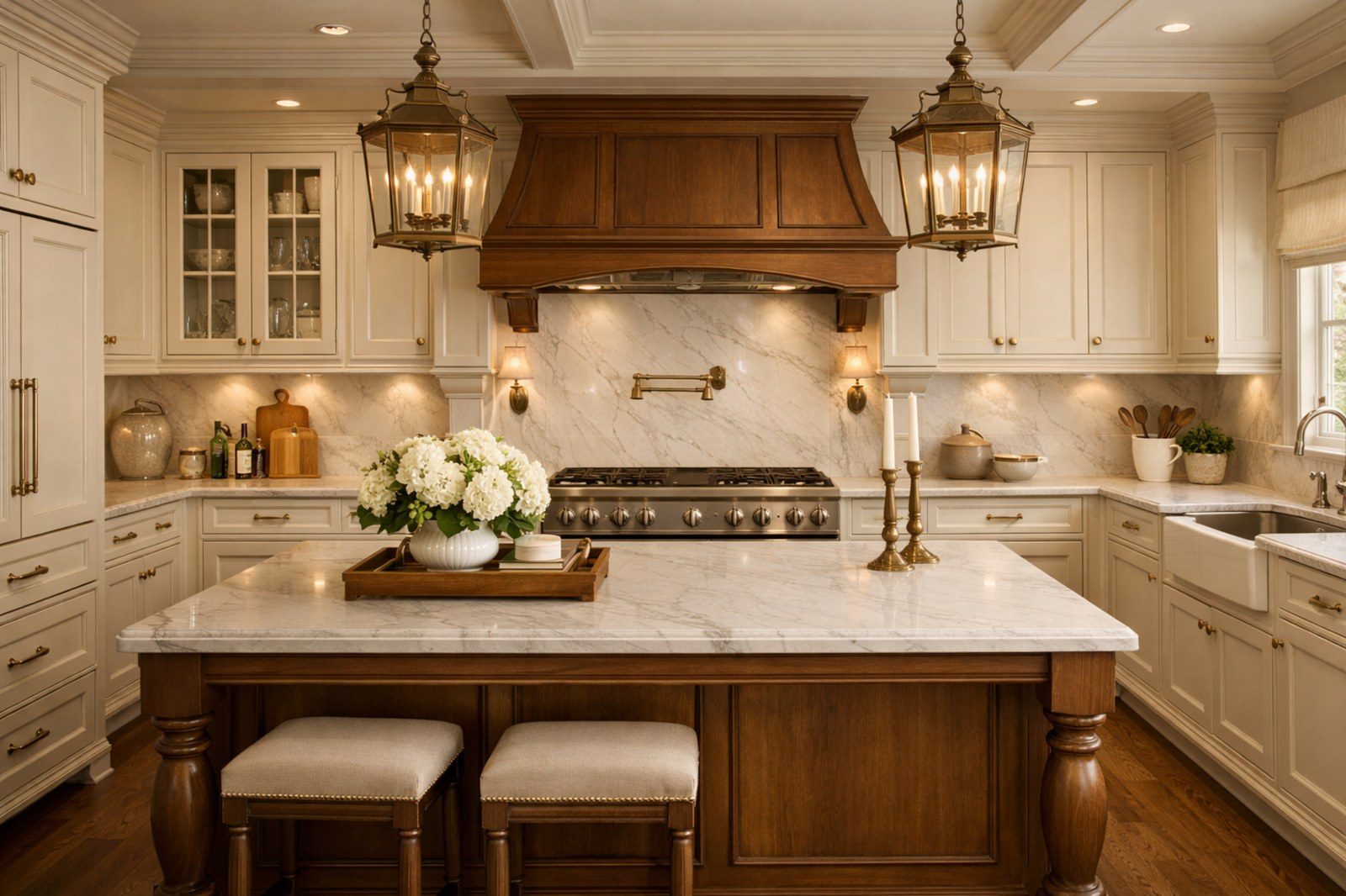
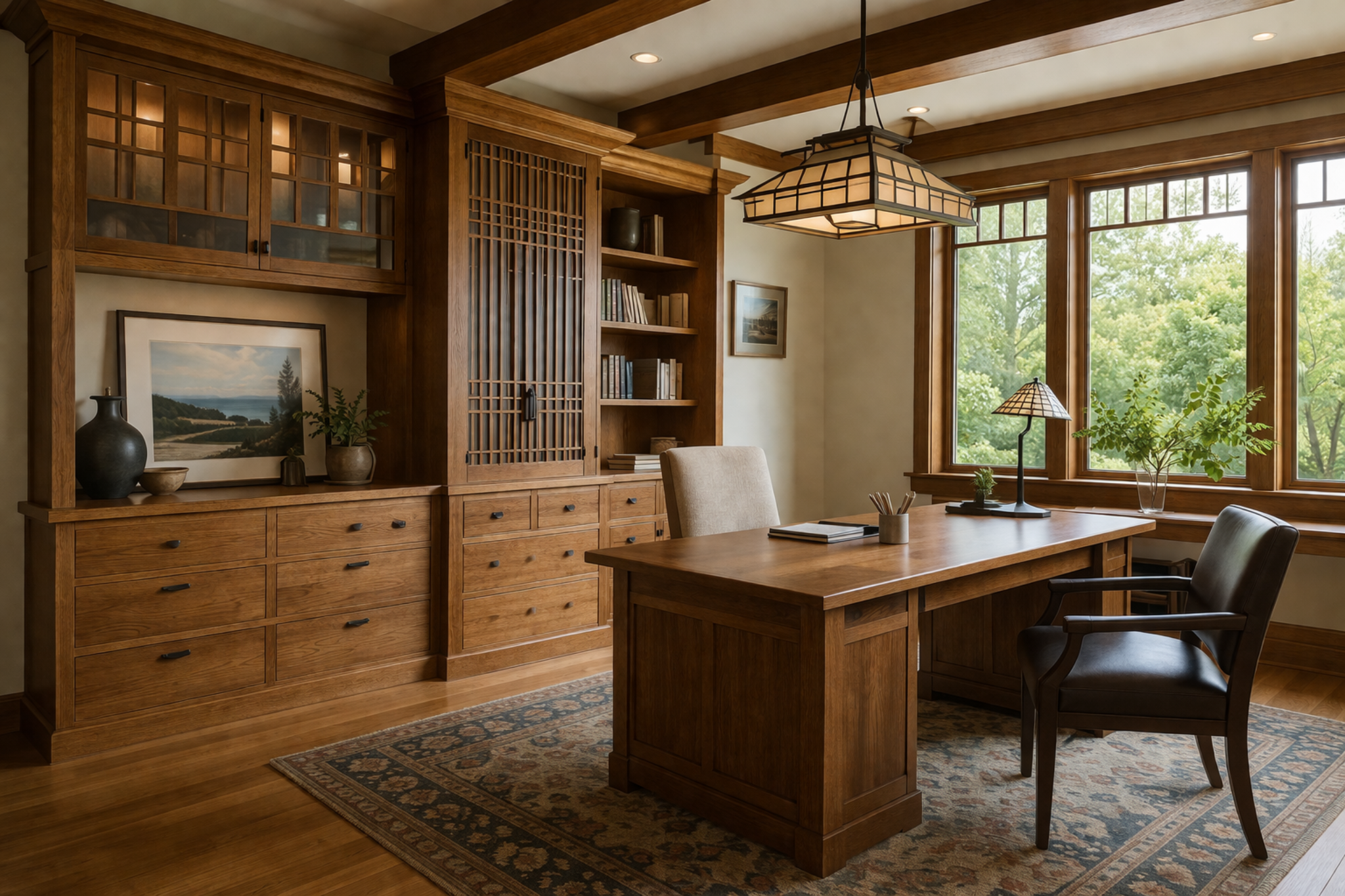
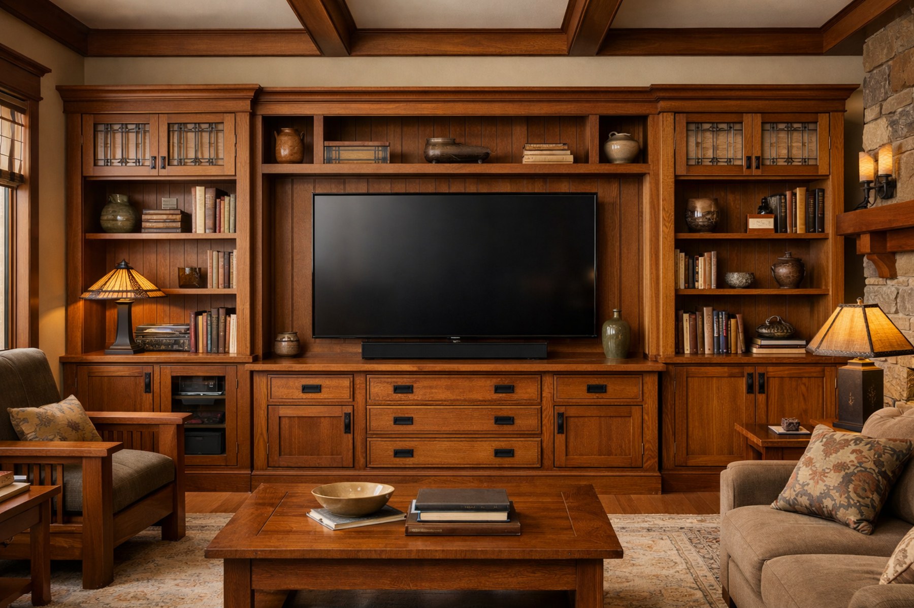
Craftsman cabinetry is rooted in woodworking, structure, and visible quality. The strongest Craftsman rooms feel grounded and substantial without becoming heavy, dark, or overly detailed.
Craftsman design values honest material, joinery character, strong rails and stiles, built-in permanence, and human-scaled detail. It is not about adding every bracket and corbel available. It is about proportion, wood quality, cabinet rhythm, and a sense that the room was made for the home rather than installed into it.
Clients who value woodwork, substance, built-ins, classic warmth, and a room that feels architectural rather than trend-driven.
The value is permanence. Craftsman rooms can make cabinetry feel like part of the home’s architecture, especially in kitchens, offices, media walls, and libraries.
Cost usually moves with stain-grade species, quarter-sawn or rift-cut woods, inset or furniture-like construction, custom hoods, visible end panels, corbels, brackets, divided glass, and carefully aligned built-ins.
Craftsman style can become too dark or too busy if wood, hardware, tile, stone, and trim all carry heavy detail. Editing is essential.
A style becomes real through the cabinetry elevation. Door shape, construction type, reveal spacing, drawer rhythm, hood treatment, appliance integration, and open-versus-closed storage determine whether the room feels authentic or simply decorated.
The cabinetry does not have to announce the style loudly. It needs to support the room consistently, from the most visible wall to the storage zones that clients use every day.
Paint, stain, countertop, backsplash, hardware, lighting, and texture need to work as a system. A beautiful inspiration image is only useful when the materials can be specified, maintained, and lived with honestly.
Quarter-sawn white oak, oak, maple, walnut tones, warm painted finishes, honed stone, soapstone-look surfaces, quartzite, handmade tile, and bronze or blackened metal all fit.
Countertops should feel substantial but not fight the wood grain. Softer movement often works better than sharp, graphic contrast.
Backsplashes can use handmade tile, slab stone, muted ceramic, or simple texture that supports the cabinetry rather than overpowering it.
Lighting should feel architectural and warm; overly delicate fixtures can look disconnected from the woodwork.
Oil-rubbed bronze, aged brass, black, dark pewter, bin pulls, square knobs, latches, and simple mission-inspired hardware can work. The scale should support the weight of the cabinetry.
Craftsman is strong for kitchens, offices, entertainment centers, mudrooms, libraries, built-ins, and range hood walls where woodworking and permanence create value.
Craftsman style depends on honest proportion, woodworking presence, and useful storage. The details should feel built-in, not applied afterward.
Evaluate cabinet rhythm, finish balance, storage visibility, hardware scale, and how the room supports everyday use without drifting from the style direction.
Use this view to confirm that the same design language can carry into another room, built-in, or cabinetry moment while still feeling natural to the home.
Client-facing style education should be honest about maintenance, specification risk, and the places where the look can stop adding value.
Detailed rails, glass doors, moldings, brackets, and stained wood collect more dust than flat modern surfaces. Wood finishes should be protected from standing water, direct heat, and abrasive cleaners.
Craftsman can feel visually heavy in small or low-light rooms. It needs lighter surfaces, warm lighting, and enough negative space to keep the craftsmanship from feeling oppressive.
The stronger the style direction, the more important storage planning becomes. Visible clutter, weak appliance planning, and underbuilt drawer organization can damage the final look quickly.
Lighting temperature and placement change the style dramatically. Warmth, shadow, and undercabinet lighting often determine whether the room feels finished at night.
Door samples, finish samples, stone slabs, hardware finish chips, tile, and lighting temperature should be reviewed together whenever possible. One sample alone rarely tells the full truth.
The right style should still make sense after the novelty wears off. A premium room needs identity, but it also needs durability, function, and restraint.
Craftsman blends well with traditional, rustic, transitional, Scandinavian, and mid-century influences. The style can be refined, casual, or architectural depending on stain tone, door profile, and trim discipline.
Before approving the direction, confirm whether the room has the right architecture, light level, maintenance tolerance, storage plan, and budget posture to support the look. That is what keeps the finished space from feeling forced.
Black Label turns style preference into cabinetry planning, material hierarchy, storage decisions, and a finished result that feels intentional under real use.